My First HTML and CSS Experience
As a part of the Viking Code School prep work I had to analyse Facebook pages from the UX standpoint and create several mockups with Balsamiq. Here are the links to both posts:
Tearing Down and Mocking UP Facebook: UX & Design Part 1 and Part 2.
This time around the task is to actually build a number of pages including the Facebook ones that are covered in the above posts. The other 2 were: Google Homepage and eCommerce shop page that sells axes for Vikings. These exercises were literally my first attempts at building something from the ground up with HTML and CSS.
1. Google Homepage
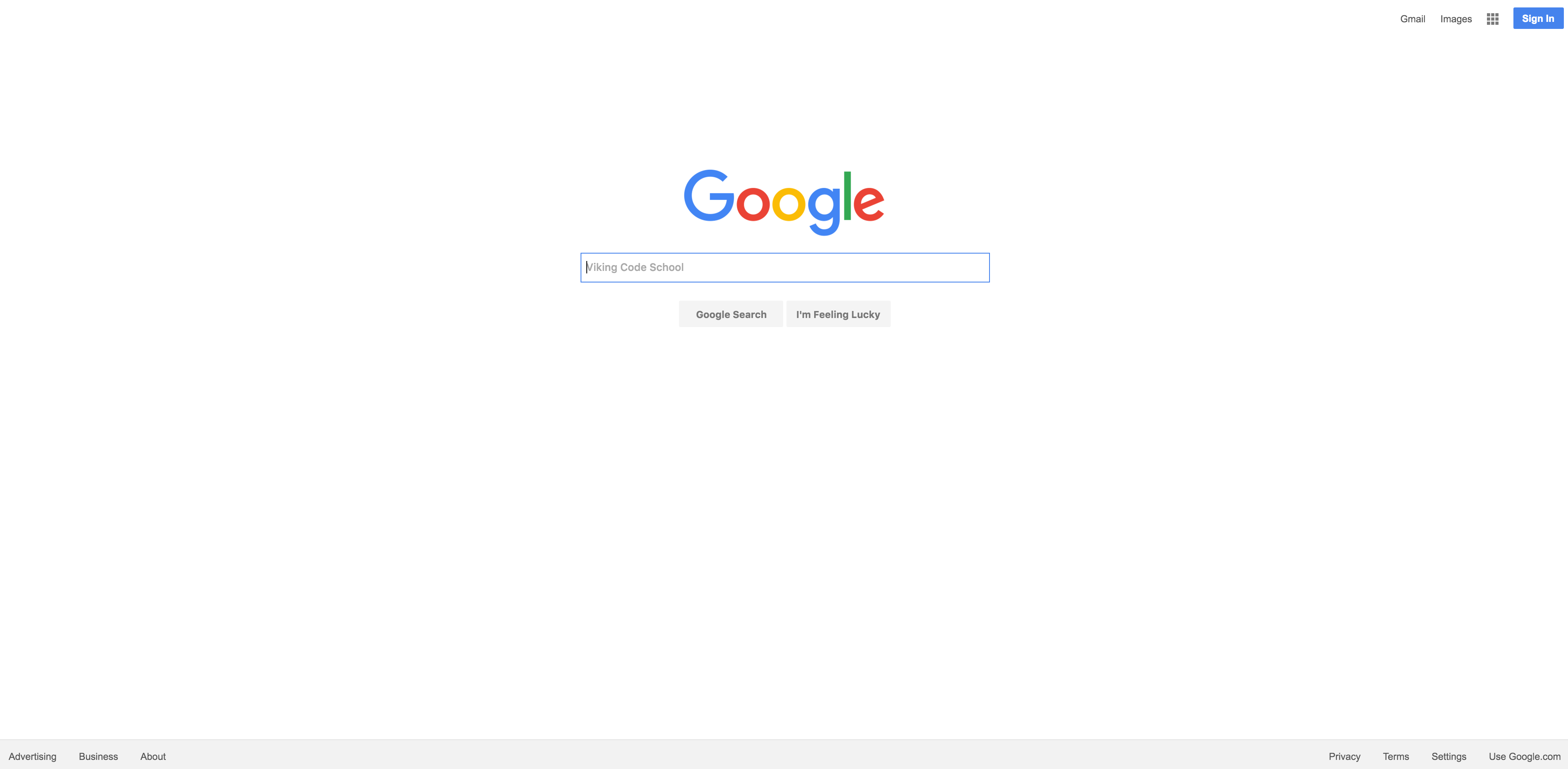
I remember reading somewhere (can’t find it now) that in development there is a rule of thumb that states something along these lines: the time expected to be spent on a project is usually 5 times longer than the original expectation. I think that was the first thing I have learned when I first started with Google Homepage. My thought was - ok I can do it in 3, max 4 hours. Well, it took me a full day to complete it. By midnight, it was still not ready.One part of me was sleepy and wanted to postpone the completion until tomorrow, the second part really wanted to finish it ASAP. The latter one had won - by 3.30 AM the page was done. Only then I realised that, firstly - it’s freaking 3.30 AM already, secondly - I didn’t stand up a single time since midnight. I was tired, hungry and looked like shit. The best part was that none of that mattered to me. I have built my first page. My. First. Page.
One part of me was sleepy and wanted to postpone the completion until tomorrow, the second part really wanted to finish it ASAP. The latter one had won - by 3.30 AM the page was done. Only then I realised that, firstly - it’s freaking 3.30 AM already, secondly - I didn’t stand up a single time since midnight. I was tired, hungry and looked like shit. The best part was that none of that mattered to me. I have built my first page. My. First. Page.
I guess this is the feeling when you build something and it actually works (I know the code might look messy, well it’s the first step at the end of the day, right?)
Here is the look:
Author:
And here is how the page looks in the browser.
2. Viking Axe eCommerce Shop Page
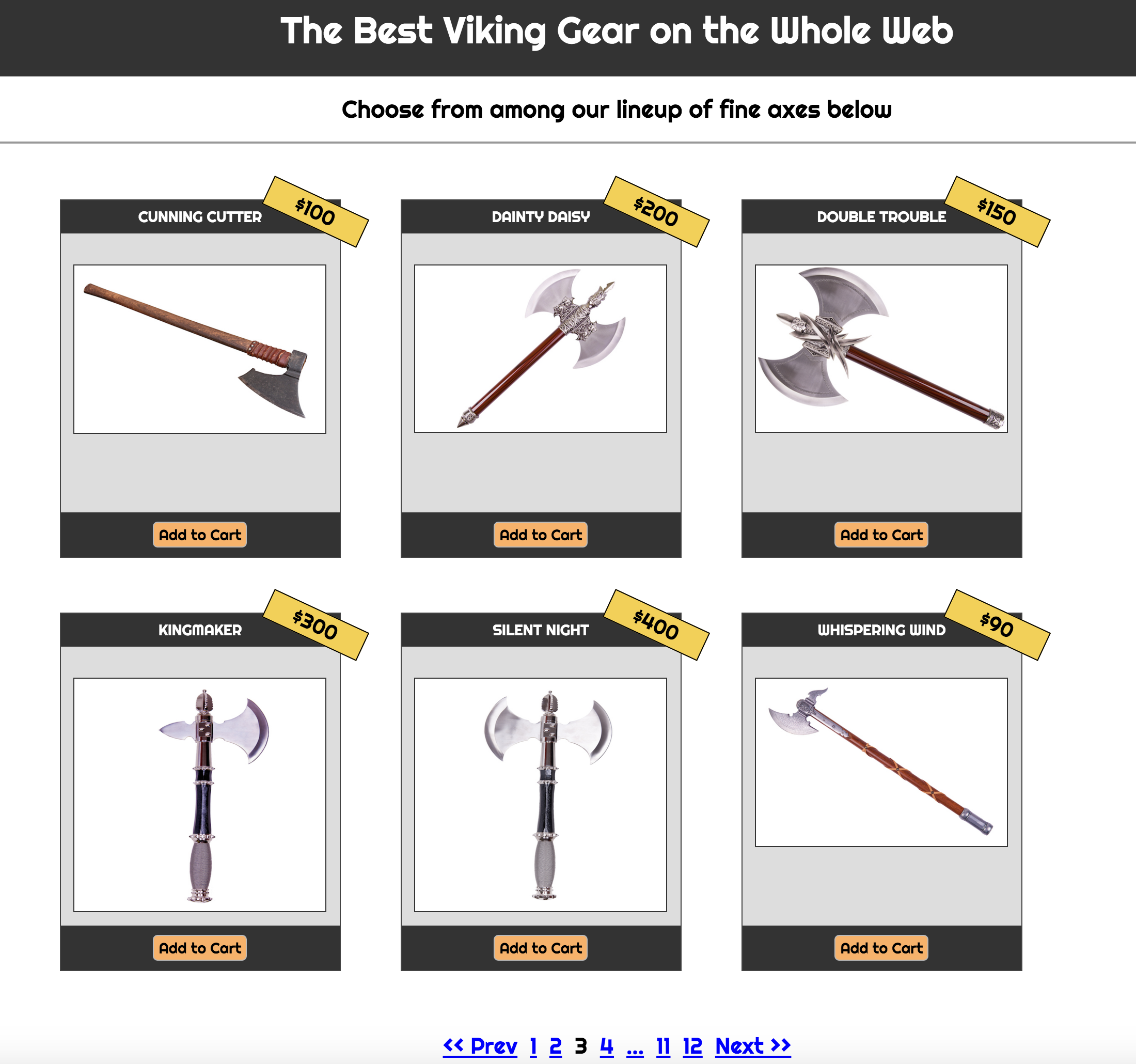
This task was a bit more challenging. I had to work more with floats and positioning. My first attempt at this looked entirely broken and I couldn’t figure out what was the reason, so I started from the very beginning.This page also took me a day to complete, and by the end of it, I definitely felt more confident in my skills. Here is the result:
This page also took me a day to complete. By the end of it, I definitely felt more confident in my skills. Here is the result:
3. Four Facebook Pages
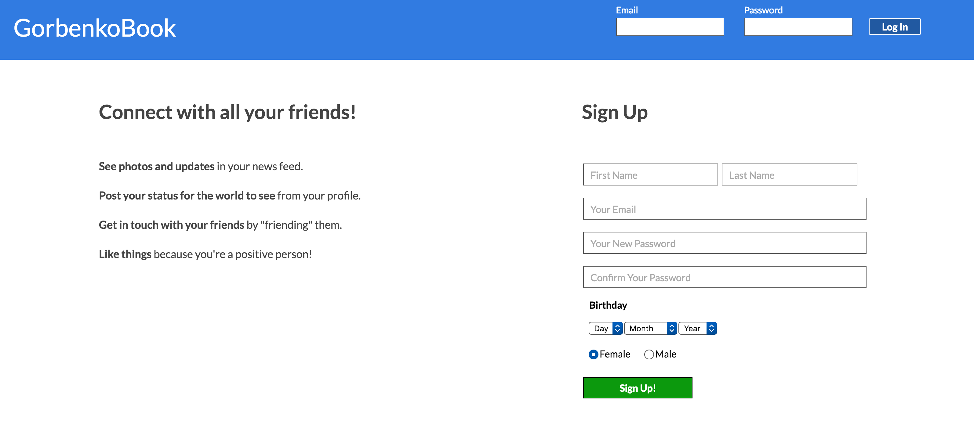
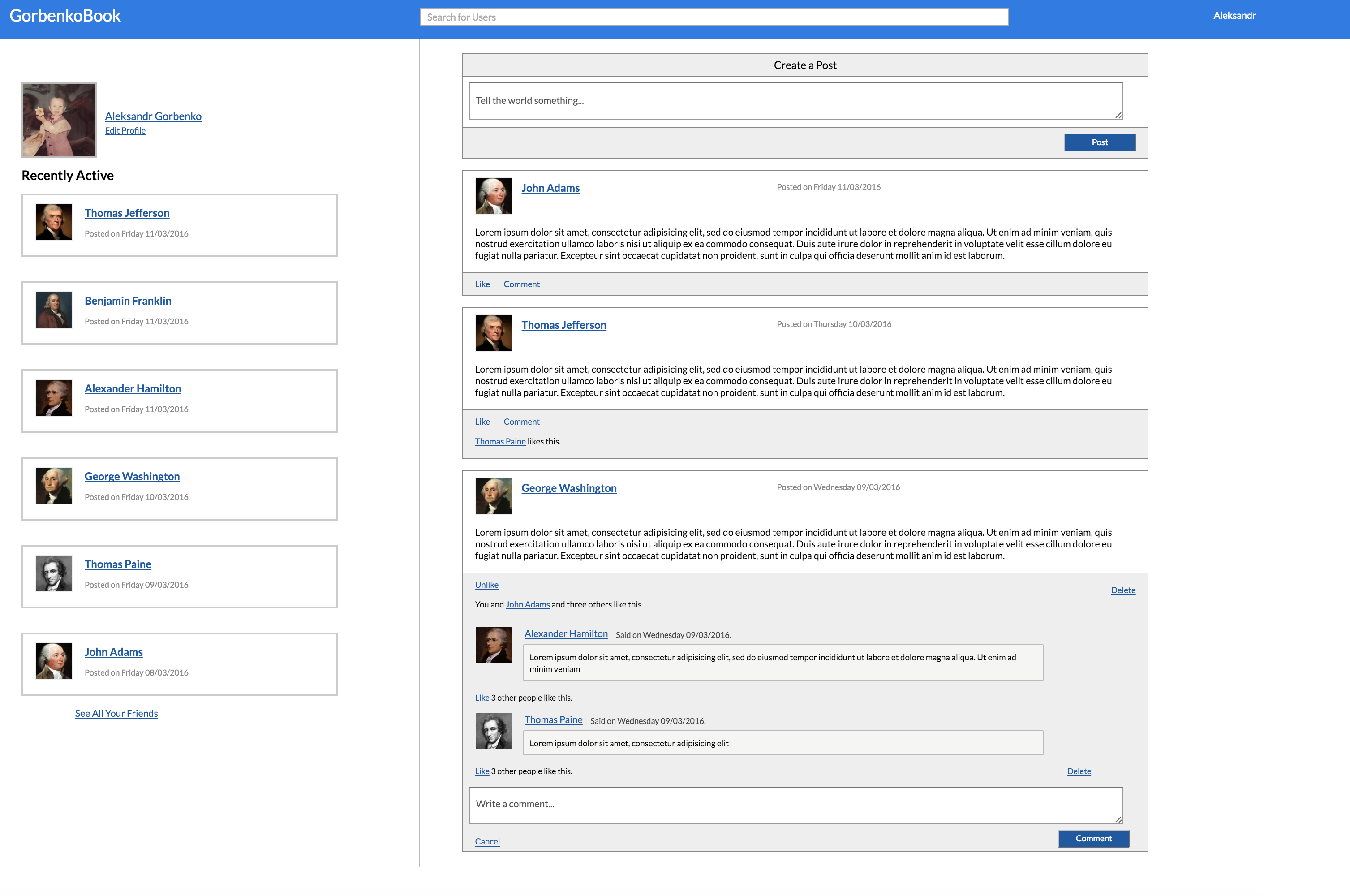
By far that was the most challenging task. Two full days spent on these. There were many more elements to be made here: forms, tables, buttons. It was a great stretch indeed. Also, to avoid any confusion, I did not use my own mockups to design these pages, instead, I used the ones from here.
Homepage
Newsfeed
About
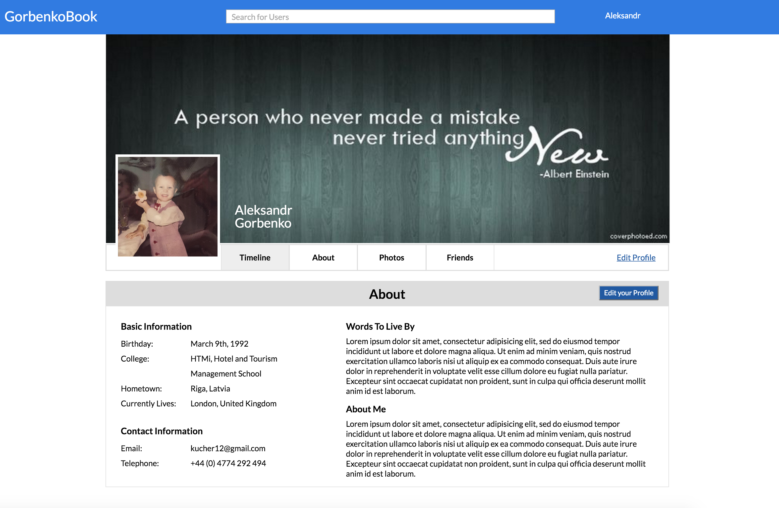
Friends
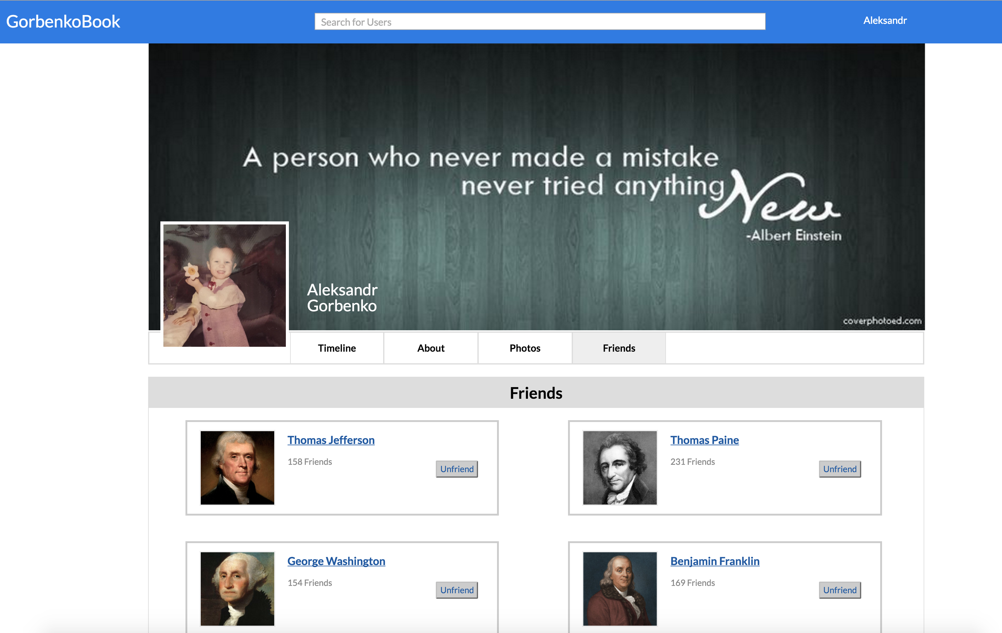
Browser look of Homepage, Newsfeed, About and Friends.
From aside, one might think that there is nothing to be proud of the pages above. Let’s be objective - they look bad…real bad. I am an SEO for the last 1.5 years and I completely agree that these pages are horrendous! (Actually, Google page is not that bad!) Regardless - it’s the first step, the next one - will be better, the following - even better. Besides, look at Facebook in 2005:
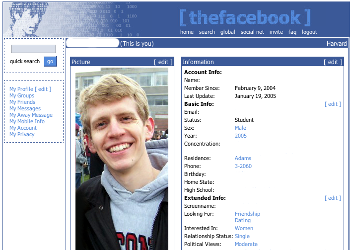
Once again, if you find yourself also following the Prep Work of VCS - feel free to use the materials, I hope you can find them helpful.
GitHub repo links to all 3 projects:
Google Homepage Viking Axe eCommerce Shop Facebook Pages
In hindsight, this is what I have learned from the exercise (apart from the actual coding part):
- More than half of errors in design are committed during the design phase.
- Your project completion estimate should be about 5 times of your original expectation.
- Don’t code till 3:30 AM, actually…scratch that - code till whenever you want if you love it!
Now that the HTML and CSS part of the Prep Work is completed, it’s time to get hands on Ruby!
