
[VCS Prep-Work] Tearing Down and Mocking UP Facebook: UX & Design Part 2
Tearing Down and Mocking UP Facebook: UX & Design Part 1
The 2nd part involves analysing 5 different Facebook pages against a set of 8 questions. In case you want to read about the task in a bit more details - check the assignment page.
This task is quite a similar to the one covered in Part 1, but a bit more granular. Let’s get started!
These are our 5 patients for the assignment:
- Facebook Home Page
- Facebook News Feed Page
- Facebook Profile Page
- Facebook About Page
- Facebook Photos Page
Part of this assignment was also to develop the mock-ups of these 5 pages using Balsamiq Wireframing tool.
I will insert the mock-ups in this post for each individual page.
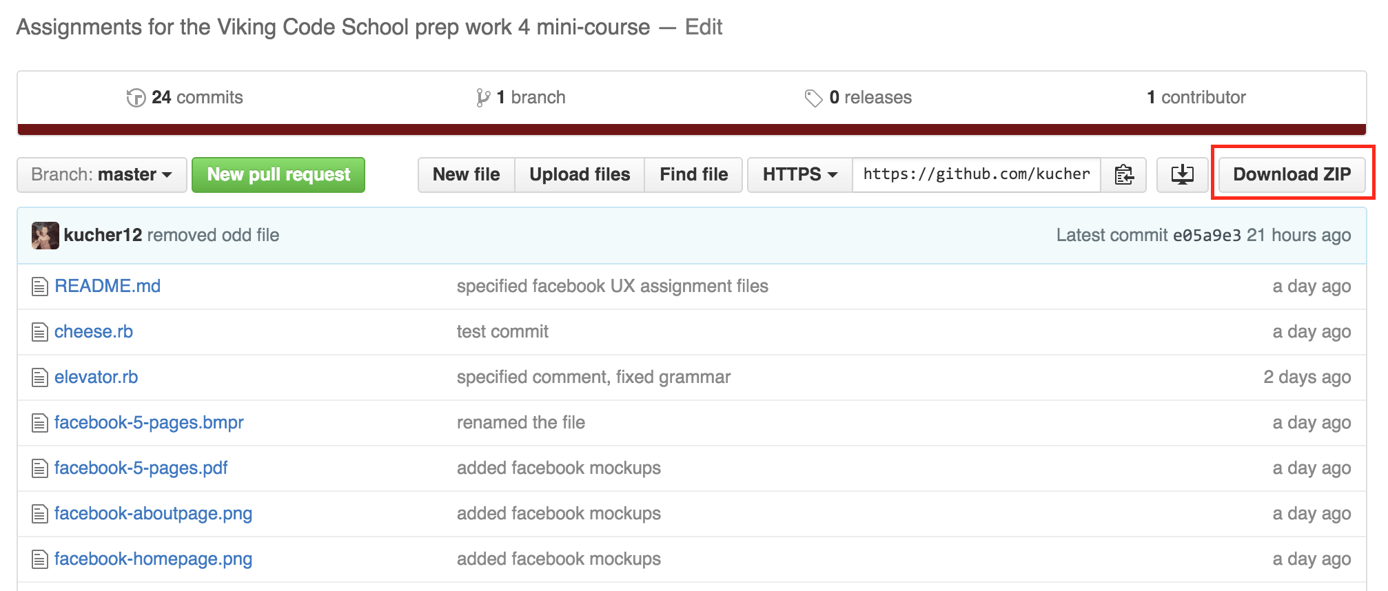
If you want to get PDF / PNG / BMPR (Balsamiq file format) files - they are available in a repo on GitHub. If you are new to GitHub, the easiest way would be to download the ZIP file:
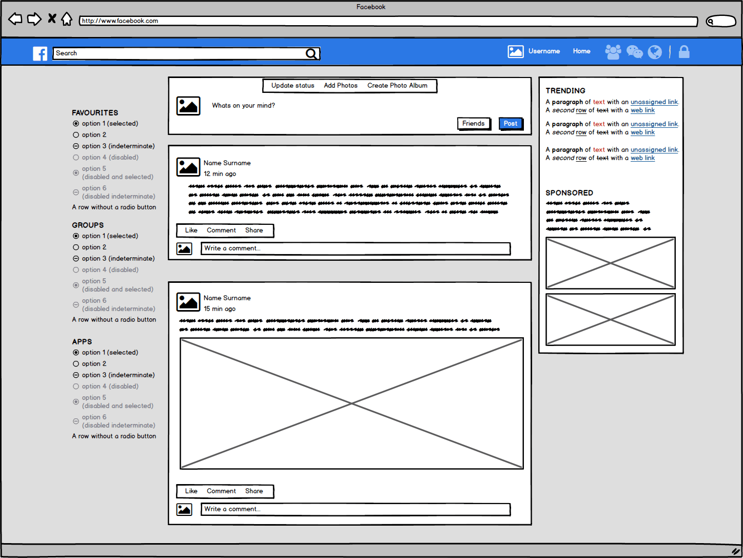
Facebook Home Page
- Who is the most likely user of this page?
A person who came to the website for the first time. A person who has an account on the website but is using other browser or machine to access the website. A person who emptied the cookies in their browser and are trying to access the site.
- What is that user’s critical goal on that page?
There will be only 2 main goals here: Sign In and Sign Up.
- Does the visual hierarchy you sketched lead to that goal?
Yes, it does for both goals. To sign in there are 2 fields in the top NavBar which are immediately visible on the blue background. The cursor also starts automatically blinking in the “Username” field so this movement attracts the eye.
There is a huge green button “Create Account” that is probably the most prominent element on the page, users who are new to Facebook most certainly will look at it first. It will then indicate that the have to fill in the fields above to access the site.
- Do the relationships between the elements lead you to that goal?
Contrast - yes, as described above the contrast between light bluish gradient, blue NavBar and green CTA button.
Page elements that are used to meet both goals on this page are aligned between themselves but not to each other (the sign in elements are not aligned with sign up elements). This makes them look unrelated - which gives more clarity to the user.
Sign up elements are close to each other as are the sign in elements, the proximity is there and ANALYSE AGAIN
- What font families are most prominent on the page?
Across the whole page “Helvetica” is used apart from one CTA button “Create Account” - it has “Freight Sans Bold” font. The idea behind having a different font just on this one element is not clear to me at this point.
- How do these font families contribute to or take away from the site’s flow?
As it is one consistent Sans-family font (almost) - experience is pleasant to the eye, the text reads well and clear.
- How do the line spacings, sizes and weights contribute to or take away from the site’s flow?
It seems to me that spacings, sizes and weights are very balanced across the page, they don’t take anything away, but only contribute to clarity of each word.
- What would you improve to achieve a better hierarchy or flow?
At this point I wouldn’t change anything, apart perhaps keeping the font Helvetica also on the CTA button. The fact that this button has different font is visible with the naked eye, but it doesn’t add anything else. CTA button is green anyway as it emphasised enough, so I would just keep one font across the whole page.
Facebook News Feed Page
- Who is the most likely user of this page?
A person who just sign in their account or just sign up and logged in for the first time.
- What is that user’s critical goal on that page?
Seeing the newsworthy information that the user is connected with easily and effortlessly. The second goal would be to post information to the News Feed.
- Does the visual hierarchy you sketched lead to that goal?
Yes, it does. News Feed is featured in the central part of the screen and posts are clearly visible on the white background. The continuity of the feed below the fold invites user to keep scrolling and keep achieving the main goal of seeing the news that their friends have posted.
CTA button “Post” is coloured blue and makes it easy for the user to see where the text or photo should be inserted to make a post.
- Do the relationships between the elements lead you to that goal?
Yes, the top box to create a post has a different in contrast to the rest of the News Feed, it has the CTA button “Post” and CTA text “What’s on your mind?” - as to show where exactly you should input the text.
The News Feed is pretty clear too, it has the gutters between each post and the same size gutters are on the both sides of the Feed to visually separate it from the other page elements on the right and left.
- What font families are most prominent on the page?
“Helvetica” across the whole page.
- How do these font families contribute to or take away from the site’s flow?
I am inclined to repeat the answer from the previous page - experience is pleasant to the eye, the text reads well and clear. It seems to be that this font will be used everywhere and it is clear that FB developers put a great amount of time into optimising the font. From my perspective they did a really great job on the “font side of things”.
- How do the line spacings, sizes and weights contribute to or take away from the site’s flow?
The CTA buttons have slightly higher line-height (22px) from the rest of the elements on the page (user names and event names = 19px) (comments and lighter text = 16px). The CTA buttons and user names are also bolded which. The fact that usernames are bolded - immediately gives the context to the content in the Feed.
- What would you improve to achieve a better hierarchy or flow?
Perhaps it’s my resolution (MB Pro retina), but the feed overall looks a bit shrunk. I think FB could have done a better job at a designing bigger, wider solution to the higher-resolution displays. (I do admit that the idea behind making the news feed narrow could be to keep the UX more or less consistent throughout all classes of devices (mobile, tablet desktop), without having on overly wide interfaces on desktop that would be looking very different from the mobiles and tablets. This is just an assumption though).
Another thing - I would increase the width of the News Feed by 1 more GRID column. That would make visual content even more prominent and sometimes perhaps you wouldn’t to open the photo in full size to see all its details.
Facebook Profile Page
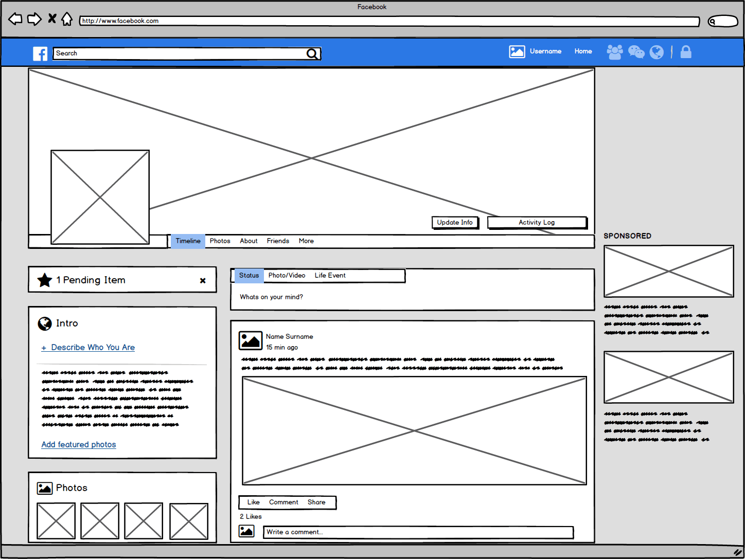
- Who is the most likely user of this page?
A user who has an account and is looking at her own account or account of another user.
- What is that user’s critical goal on that page?
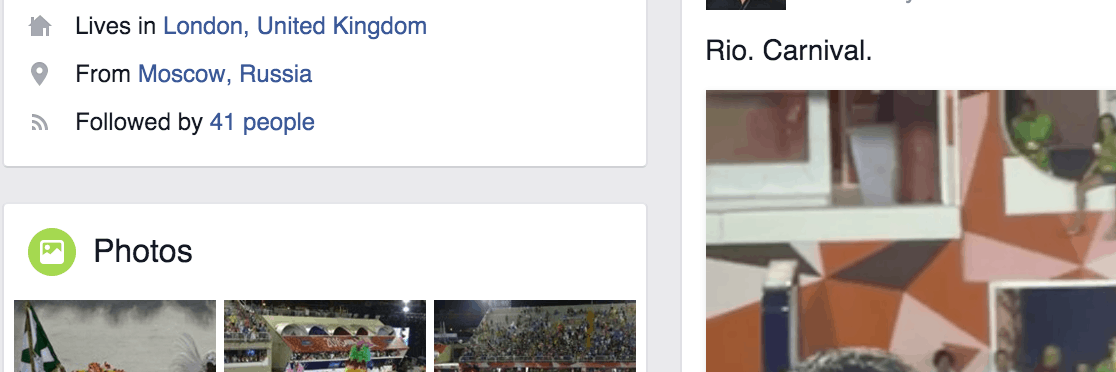
Seeing the basic information about a particular user. Pictures seem to take the most of the space on the page, and text info (such as education and work) is de-emphasised (coloured in light grey), which makes me conclude that the main aim here would be to look at the pictures of another user.
- Does the visual hierarchy you sketched lead to that goal?
Clearly, yes. There is a cover photo, that is basically taking the top section of the page, the profile picture of the user in the white frame. Photo tiles on the left lower part of the page. The second element in the hierarchy is the Timeline of the user and her most recent posts. As mentioned before, the text on this page is mostly is de-emphasised.
- Do the relationships between the elements lead you to that goal?
The first thing that I have noticed are the gutter sizes - they are different! See examples below:
and
I think it really helps to separate various visual elements on this page better.
Photos location is clearly visible from the start so they are literally the first thing that captures the sight.
- What font families are most prominent on the page?
“Helvetica” across the whole page.
- How do these font families contribute to or take away from the site’s flow?
If the goal was to learn more informational about another user but to look at her photos, then font in the category tabs (About, Friends, Photos, etc) is emphasised, it is bigger (19px). The line-height is also much bigger - 43px, it’s also bold. So that puts it apart from the other text elements and makes the journey of the user easier to continue.
- How do the line spacings, sizes and weights contribute to or take away from the site’s flow?
See my observations in the previous question.
- What would you improve to achieve a better hierarchy or flow?
Reverse the gutter size between the News Feed page and Profile page. I don’t think such huge gutter is necessary on the Profile page because it has a very specific context (another user) and all information is within this context - photos, intro, posts, friends. Unlike on the homepage where the gutter separates elements that are in different in context - left NavBar (groups, events, apps, favourites), News Feed, and right Column with Ads and Trends.
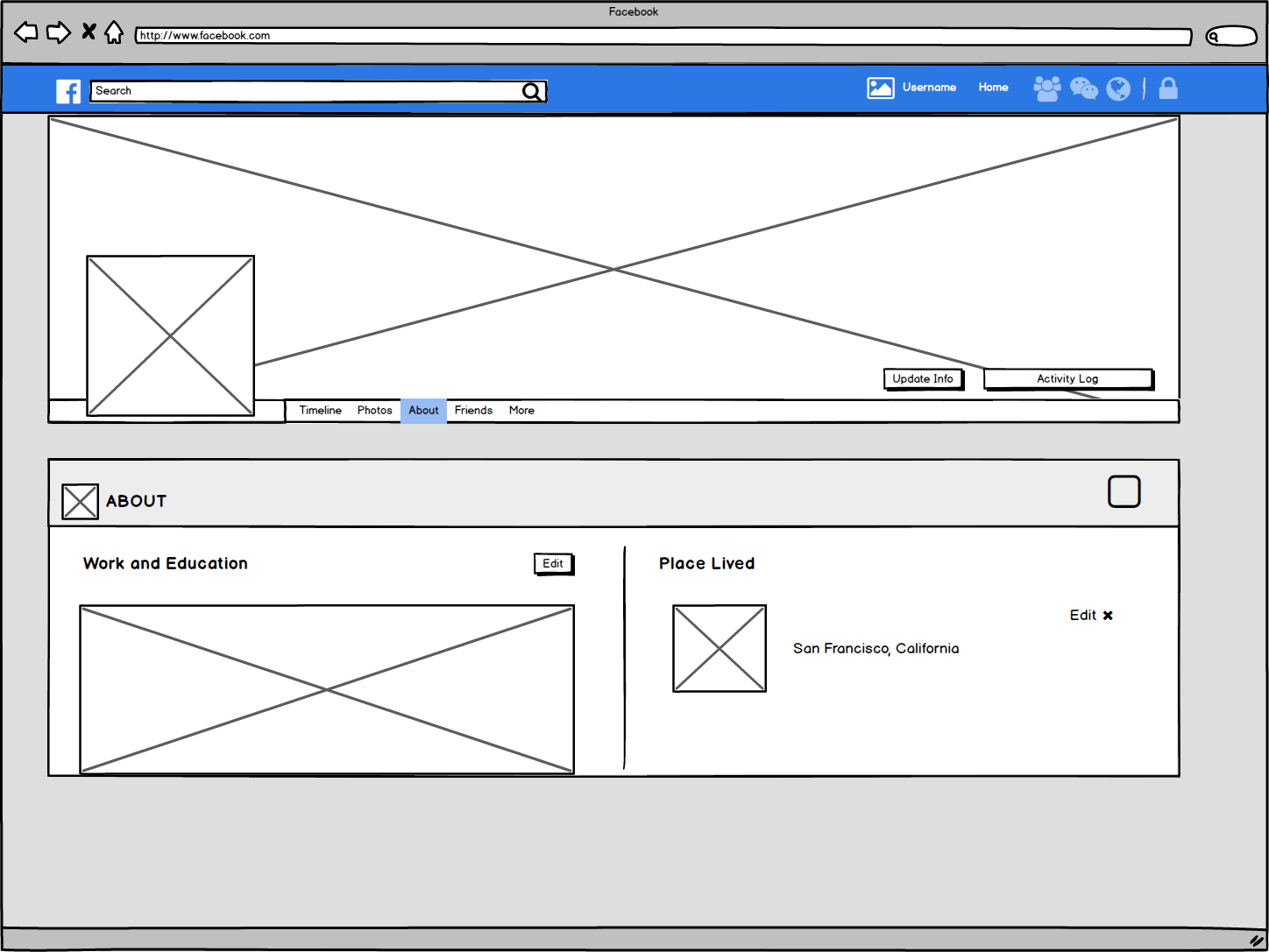
Facebook About Page
- Who is the most likely user of this page?
A user who has an account and is looking at her own account or account of another user, specifically About page.
- What is that user’s critical goal on that page?
Learning more about the background information of another user, such as Education, Past Work, Contact Details, Places of Living, Family Status.
- Does the visual hierarchy you sketched lead to that goal?
It is very clear indeed. On the left, there is a list of information categories, while in the middle you get the actual information from that particular category. This info is in the middle of the screen and there is a lot of breathing space within the text, which makes it really easy to absorb it.
- Do the relationships between the elements lead you to that goal?
About section is essentially in the “box”, separated by a thick gutter from the top Cover and Profile photo and from the Friends box under it. Once again the goal is met easily by having this clear separation.
- What font families are most prominent on the page?
“Helvetica” across the whole page.
- How do these font families contribute to or take away from the site’s flow?
Please refer to the observations in the analysis of the previous page.
- How do the line spacings, sizes and weights contribute to or take away from the site’s flow?
Please see questions 3 and 4.
- What would you improve to achieve a better hierarchy or flow?
Nothing. So far it the cleanest and non-distractive page of all that achieves the goal really good.
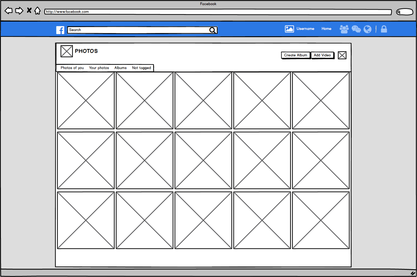
Facebook Photos Page
- Who is the most likely user of this page?
A user who has an account and is looking at her own account or account of another user.
- What is that user’s critical goal on that page?
Seeing albums of pictures from a particular user.
- Does the visual hierarchy you sketched lead to that goal?
There are only 2 elements in the hierarchy here: photos and top navigational elements (back to Timelines, About, etc). The goal is clear here - watch the darn photos :)
- Do the relationships between the elements lead you to that goal?
Absolutely. There is not much relationship here, though, the page is predominantly filled with photos and very little text.
- What font families are most prominent on the page?
“Helvetica” across the whole page.
- How do these font families contribute to or take away from the site’s flow?
Please see my observations of the previous pages.
- How do the line spacings, sizes and weights contribute to or take away from the site’s flow?
Please see my observations from the previous section.
- What would you improve to achieve a better hierarchy or flow?
It seems this page was also made as simple as possible, there is literally only 1 main action a user can make - click on any one photo and keep browsing through with the left and right arrow controls.
Not much can be improved here, except for one thing. I would add the Year Timeline on the right-hand side of the photos so as it give the time context to the photos of when they were uploaded, without the need to open each photo. Years in this timeline should be clickable too if a user wants to jump to the past posts and see photos (e.g.) from the last year.
In case I sounded a bit confusing, this is the Year Timeline I referred to:
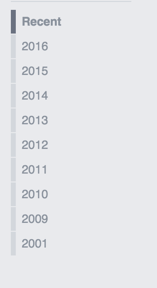
P.S Just realised that it is now absent from the User Profiles and visible on the “Pages” (such as company pages).
Summary
Alright, so that wraps up the assignment. I think it was a really good exercise - it makes you think a bit more critical of what you see. I have noticed that during analysis it really helps to think from a perspective of a non-technical person, a very limited user in terms of computer literacy (dummy). Likely my flatmate is just like that, so I know where to go if I ever need to test my designs in the future :)
Having such approach helps to raise the right questions on various elements on the page and actually can give insight on what could be done better to make things easier for an average user.
And having said that - I would rate the Facebook UX on these particular 5 cases at around 8/10. This is a subjective mark of an aspiring developer who had just covered the UX fundamentals.
If you read till this far - first of all thank you for sticking around! It wasn’t the shortest post of all. Hopefully you have learned from this exercise as much as I did, if not more!